
He introduced, along with his contemporaries and protégés, the many ideas and aesthetics of European Modernism. The following quoted philosophies from Brodovitch resurface repeatedly when we look at Brodovitch’s work, making it even more difficult to categorize him into a single movement. Brodovitch once said, “We must discover new ways of communication” (Grundberg). Though he was influenced by movements such as Art Deco, Dadaism, Constructivism, Bauhaus, and Surrealism, Brodovitch advocated non-stop reinvention of visual stimulation; the man was known for prompting his students with “Astonish me!” To a student, he also said, “Do it in the manner of Cocteau, but do not imitate Cocteau” (Purcell).
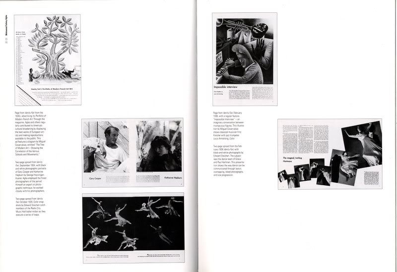
Brodovitch’s ability to appropriate ideas and solutions in order to come up with his own working method set him apart from his peers. He worked with the ideas of peers and students, fusing them with his own beliefs and passions. For example, M.F. Agha of Vanity Fair had began arranging images in a fan shape across spreads before Brodovitch had, but what makes the two methods different was how they were handled. Brodovitch considered the content of his images and the movement of the form with text carefully as to not obstruct the page’s meanings, while Agha was less careful and covered integral parts of photographs in layouts.
The word “flow” also plays an important role in his process, relating to how cinematic and pacing qualities surfaced in his work. Many fellow editors, assistants, and peers marveled at how fluidly Brodovitch worked from piecing each page to finally putting the whole book or magazine together. Believing that “magazines and books, like films, are experienced sequentially over time,” he would lay out all the pages across the floor to see how everything visually flowed (Grundberg). To him, flow “did not mean a seamless uniform consistency, but a temporal, visual experience with peaks and valleys” which writer Andy Grunberg and other historians also likens to film. El Lissitzky, a designer during Brodovitch’s time, shared a similar viewpoint, once writing, “A sequence of pages is a cinematic book” (Grundberg). Thus the analogies of magazine spreads as film scenes and whole books and magazines as a whole film become apparent. I chose what I thought were three of Brodovitch’s most influential works to study in which the cinematic qualities associated with his philosophy of innovation and flow appear; a Harper’s Bazaar magazine spread from an August 1955 issue titled “Two Guys and The Devil’s Advocate”; a graphic arts magazine he also served as art director from 1950-1951 called Portfolio; and Brodovitch’s own photography book Ballet.
Though he had numerous freelance projects, Harper’s Bazaar was a stable job for Brodovitch where he worked for 24 years and gained notoriety especially within the graphic design and photography world for over half of his 40-something year career. The fashion magazine, a Hearst publication, desperately needed a revamp in the early 1930’s, and editor Carmel Snow recognized Brodovitch’s talent and hired him to modernize the publication within days of meeting him at an exhibition of his work (Purcell). It was a playground for the art director to experiment with typography and imagery in elegant and tasteful compositions while establishing already famous designers, artists, and photographers as he brought new talent to light for the American reader. Against the backdrop of the Depression until World War II, Brodovitch brought a sense of escapism to the magazine spreads using Surrealist influence as Bazaar integrated lifestyle with fashion (Grundberg). When World War II broke out, and the magazine’s pages emphasized the neatness of white space, making the use of space more economical, reflecting the real economy of scarce clothes and rations of food (Grundberg). When the times changed, Brodovitch also changed his process, using expressionistic photographs in his work at Abstract Expressionism’s rise post-World War II.
It would be neglectful to not talk about one of Brodovitch’s other greatest achievements in graphic design: Portfolio magazine. Frank Zachary and George Rosenthal, two designers, had the idea to start a graphic arts magazine and sought Brodovitch to art direct it (Purcell). The magazine featured no ads, making it a literal clean slate for Brodovitch to experiment with; unlike his job with Bazaar, he no longer had to worry about ads interrupting the flow of his work. With Portfolio, Brodovitch was able to carry out his ideas of finding new ways of communication, creating what Zachary later called a “graphic experience” (Purcell). Words and pictures now began to integrate more freely than they did before, creating more white space, which Brodovitch also advocated. Diana Vreeland, fashion editor of Harper’s Bazaar during Brodovitch’s tenure, recalls his view of “the more [white paper] the better,” and she adds, “it was indeed very hard for him to allow even the most beautiful blow-up of a Cartier-Bresson photo to spoil the immaculate clarity and whiteness [of a blank page]” (Grundberg). Also unlike his time at Harper’s Bazaar, Brodovitch did not have to answer to editors like Diana Vreeland and Carmel Snow, where he commonly reworked photographs or layouts to show the fashions better or to highlight the designers the editors favored (Grundberg). Portfolio included Brodovitch’s other interests in the fine arts and design world along with photographic work by his protégés Richard Avedon, Irving Penn, and more. Despite a very short life of three issues due to rising production costs with no funding, the art director’s work for Portfolio is considered just as, if not more than, influential and creative as his work for Harper’s Bazaar by writers such as Kerry Purcell and Andy Grundberg.
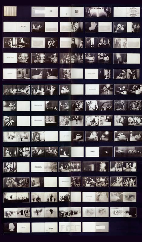
Ballet is a book of Brodovitch’s own photography published in 1945 by publisher J.J. Augustin in New York. The book, divided into 11 sections, contained 104 photographs of scenes from the Ballet Russes in front of and behind stage that Brodovitch captured in the mid 1930’s. Here, as we will examine later, the Book of the Year (1945) – according to the American Institute of Graphic Arts – shines as the premier example of why Brodovitch’s work shares the same qualities of film (Purcell). The union of experimental photography, elegant typography, and experimentation of layout marries his design and artistic passions together perfectly. With Harper’s Bazaar and Portfolio serving as his contributions to magazine and graphic design, Ballet helped push for more expressionistic photography which became popular in the Sixties. Brodovitch felt that the “photograph is not a pictorial report; it is also a psychological report” (Purcell). And with those ideas, what mattered most was whether or not the picture could grab a viewer’s attention. His photos emphasized the dramatic and theatrical mood of ballet while pinpointing the effect of motion recalling the experiments of Futurist photographer Anton Bragaglia in the early 20th Century.
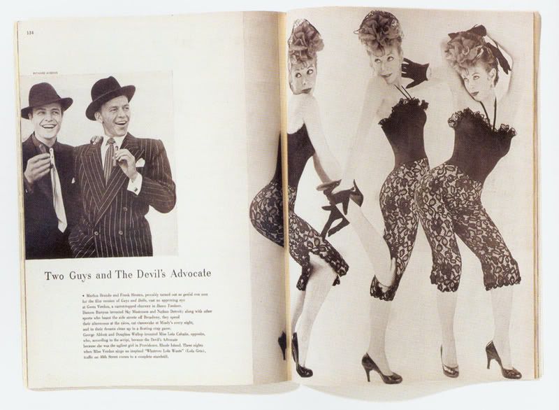
"Two Guys and The Devil's Advocate"
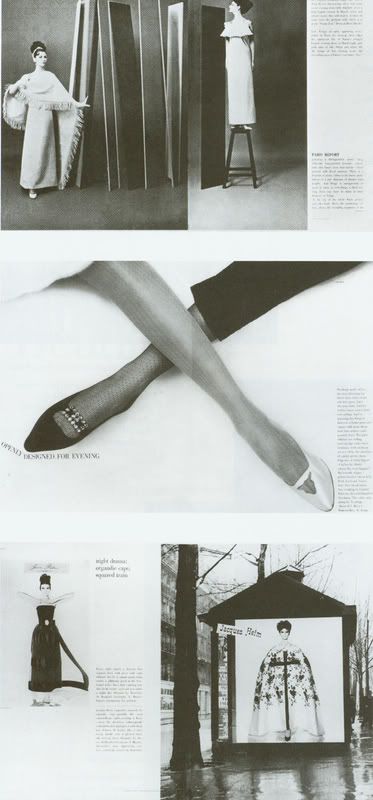
Now that we have made acquaintances with the works I have chosen, let’s take a more in depth look at what makes each work interesting and how it relates back to the motif of cinema and the theme of flow. “Two Guys and The Devil’s Advocate” resembles a still from a movie scene most. The magazine spread features Frank Sinatra and Marlon Brando together in a small photo on the left with a full page photo of actress Gwen Verdon bleeding over into the left (both photos were by Brodovitch’s main protégé, Richard Avedon). The photos of the actors depict them grinning and glancing to the right as if they were in the same scene as Verdon, who poses coquettishly and appears as a photomontage of three images. The resulting mood is whimsical and fun, the spread acting more like a space than a sheet of paper; the cropped photo of the two actors gives a feeling of perspective as if they stood behind Verdon who appears larger. Text about the actors and their movies appears beneath the photo of Brando and Sinatra. What is distinctive about this particular spread is how it truly embodies the film aspect and the ingenuity of Brodovitch’s work. The film aspect is established in this manufactured scene by composition of the editorial elements and juxtaposition of images. The photomontage is an influence of Constructivism, breaking away from the American tendency to place single photos in framed boxes while introducing European ideas. Visual stimuli occur due to the contrast in size of the images facing each other. First we see the smaller picture, then our eyes break into the white space before bleeding into the blown-up picture; the progression of the spread peaking is evident, making it similar to a movie scene’s climactic point. In a single layout, unable to truly use pacing (as he would in a book or whole magazine), Brodovitch still managed to give us a brief visual and temporal experience by providing interest points that we perceive over a moment of time.
Portfolio Spreads
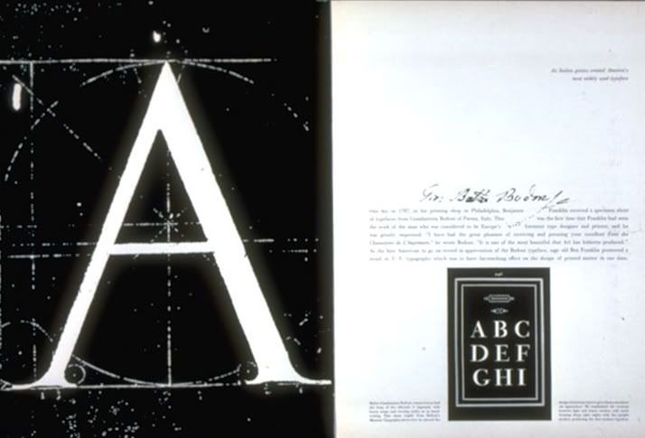
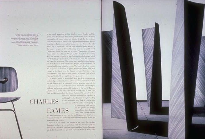
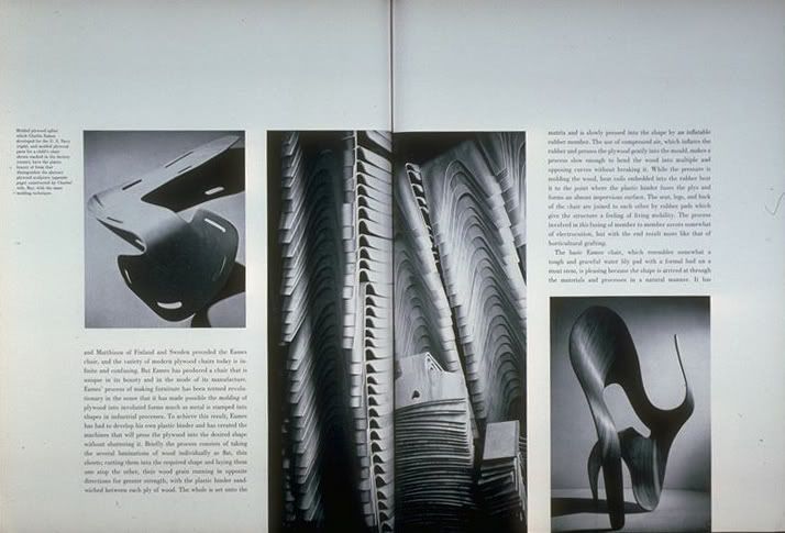
The Portfolio spreads chosen mimic aspects of “Two Guys and The Devil’s Advocate” in a few ways. Because the magazine featured no ads, Brodovitch was able to pace the pages and embody the spirit of cinema. The rising and falling of the spreads’ compositional elements in relation to each other are like plot twists and shifting scenes. First, our attention is drawn to the dark negative print of the “A” on the left side of the spread about Bodoni type, then, after flipping the page, the image of curved panels of statuesque wood on the right pulls our interest in to read about the Eames. The third layout demonstrates pacing and flow once more when our eyes follow the diagonal line of photography from the upper left hand corner to the lower right hand corner so that our vision can take a brief rest before the next page is revealed. Photography once again plays a leading role in the spreads about stacked chairs, conjuring a scene with high contrast, while Brodovitch collages an image of an Eames chair onto the left side of the second layout, cutting it in half for an interesting composition against the blown up photo of sculpted wood. White space is abundant in conjunction with text responding to images and each other in elegant ways. For instance, the Bodoni layout’s paragraph wraps around the script title text, the Eames article title pushes into the article text, and in the stacking chairs spread, paragraphs create complete columns with the photographs. These arrangements continue to push Brodovitch’s ideals about innovation and visual stimulation.
Ballet
While the magazines expressed integration of text and images to produce flow and pacing to simulate a cinematic experience, it is Brodovitch’s photography book Ballet that exemplifies film qualities the most. Looking at all the pages laid out with each other strengthens this idea. The beginning starts out with a degree of lightness due to photos with lighter tones paired with introductory text on pages with plenty of white space, mirrored by the heavily dodged photos at the book’s finish; the middle portion looks considerably darker with some spots of lightness created by section title pages that provide resting points and a change of movement. We could look at those rests in the book as scene changes or quick cuts for a movie. The abundance of white space on pages that featured text juxtaposed with the dark photographs adds more visual interest to the overall composition, similar to filmmaker Sergei Eisenstein’s belief in “conflicts within the frame” equaling “conflicts within a page” (Grundberg). The photographs captured motion in a dreamy way by accentuating blurs and dramatic lighting, setting a mood in a way that film would. Furthermore, to do the same thing again, Brodovitch organized some separate photographs together on a page, using darkness and blurs to synthesize them into what appeared to be one image that spanned across two pages; this is a similar technique to Eisenstein’s use of montage where he combined two different film scenes together to illicit an emotional response (Grundberg). The single photos, the blown up ones, and the combined ones all look like film stills alone, but we can imagine flipping through the book and visualizing the photos racing past our eyes to see the ballet performers dancing.
His photos highlighted his push for experimental photography that influenced the style’s rise throughout the 1960’s (Purcell). Even though much of the book focused on photography, Brodovitch considered typographic elements, too, choosing typefaces for each section that he felt related to the ballet’s style. The introductory text, laid out simply, does not distract from the photos. Despite having pushed expressionistic and experimental photography forwards, Ballet still faced criticism early on by some professionals calling the photos “amateurish” when Brodovitch, in reality, had put in a lot of effort to dodge, burn, and airbrush the photographs to achieve the feeling he sought. The book is a prime example of how important to him was the notion of being inventive and different.
I have written about what makes Brodovitch’s work unique and interesting and how his personal philosophies surfaced in his work again and again along with the motif of cinematic characteristics. But what historical contexts propelled him forwards and what precedents did he set? As mentioned before, Brodovitch lived in Paris for about a decade, greatly influenced by the flux of many European Modernist ideas. Even when he became art director for Harper’s Bazaar, Brodovitch made yearly trips back to Paris for several years to recruit established talents like A.M. Cassandre and Man Ray while jumpstarting the careers of new photographers like Richard Avedon, Hiro, and Paul Himmel. With each movement’s rise, he adapted new ideas to apply to his own work. The 1930’s saw Surrealism on the rise, so his magazine layouts featured intense cropping and tilting of photographs to create images of the unexpected and unreal. As Swiss design and Bauhaus design came to the forefront in the 1940’s to the 1950’s, his layouts began to follow some modular and grid-like patterns; the reinventing nature of his spreads is what defines him as a designer who wouldn’t settle for visual mediocrity within a single “style.”
Examples of M.F. Agha's work
Examples of Henry Wolf's work
It wouldn’t be incorrect to call Brodovitch an exceptional designer and figure in the history of art direction. Henry Wolf succeeded Brodovitch as art director at Harper’s Bazaar, and author Kerry Purcell reports that Wolf “suffered from Brodovitch’s excellences for many months [after Brodovitch departed]” (Purcell). However, it should be noted that Brodovitch’s brilliance wasn’t always his own. People often credit Brodovitch for the two-paged spread, but the fact is that he used it after M.F. Agha of Vanity Fair and Vogue (who started the trend several years before Brodovitch came to the U.S.) in different ways through the composition of text and photographs (Grundburg). Agha also started using cropped photographs and photography in general in experimental ways to change the design of spreads forever before Brodovitch started working at Harper’s Bazaar. Brodovitch followed these ideas and reinforced them by refining the techniques Agha employed, making the changes long lasting through his success.
From a design standpoint, Brodovitch did help make Harper’s Bazaar avant-garde, but we also have to consider editor-in-chief Carmel Snow’s influence. When she was chosen to bring the magazine out of decline, she had a vision for the publication, and having worked with Agha, she also knew that bringing in European influence was the way to attract readers (Grundberg). She had begun the process of hiring photographers and recruiting some European artists and designers to reinvent Bazaar, a task that Brodovitch took to seriously when he came on board (Grundberg). Since Snow decided the magazine’s contents, she also decided which of Brodovitch’s spreads needed to be edited or redone before making it into the final book. Therefore, the claim that Brodovitch pushed Harper’s Bazaar to new levels must be reevaluated because of Snow’s vision and authority over him; to a certain degree, Snow had as much to do with Brodovitch’s great influence. The opposite should hold true, too, for if the magazine world views Snow as the sole person responsible for lifting the magazine to great heights, then they too are failing to recognize the collaborative effort between Brodovitch and Snow that produced success.

Menu Redesign Project
Perhaps Brodovitch took his own advice to students best, and that is why he is still recognizable and inspirational today; he was able to work in the manner of asked of him, though he never outrightly imitated. For him, it seemed like a constant collaboritve process between his personal ideas and the ideas of others and Modernist movements. Inspired by that very philosophy, I redesigned Pho Thai Son’s menu under Brodovitch’s ideas. Because I was initially inspired by Brodovitch’s layouts for Harper’s Bazaar, I wanted to bring an editorial feeling to the menu. The first step was to take photographs, and rather than depicting the food, I wanted to show the utensils and bowls in an expressionistic way through composition and use of filters. The idea of cropping images and bleeding them off the page, while keeping to double-paged layouts stuck with me. In his manner, I also preserved white space and played with the text integrating into the photos and mimicking forms. To create more visual interest and to explore the idea of spreads breaking beyond the page’s boundaries as a way to bring my own point of view in, I organized text to also be cut off to a point where legibility was not totally compromised. It is successful in that it is clear Brodovitch served as the influence in this exercise, though it is unclear to me if I was successful in achieving the level of elegance and flow found in his work. The two repeating/alternating layout templates are problematic to Brodovitch’s idea of innovation and visual stimulation.
To work in Brodovitch’s manner means to challenge one’s self to think of ways to push into the experimental and imaginative realm – the burden of influence will always be there as Brodovitch undoubtedly experienced himself. Brodovitch’s talent did not come from some hidden genius (maybe some!), but it came from many sources that affected him, whether they were Modernist movements’ ideas or the people he collaborated with and guided. Not wanting to be the exact same as anyone else drove him to continuously think of ways to stimulate the viewer; that is probably the most important thing to remember when we look back at his influential body of work.
_______________________
Grundberg, Andy. Brodovitch (Masters of American Design). Harry N Abrams; New Ed edition. 1989.
Hodik, Barbara and Roger Remington. Nine Pioneers in American Graphic Design. The MIT Press. 1989.
Purcell, Kerry. Alexey Brodovitch. Phaidon Press. 2002.
1 comment:
Awesome article!! Content is well written and very informative, thank you for taking the time to write this :)
Post a Comment